DRW ARCHITECTURE BLOG

Grant Park Residence Complete

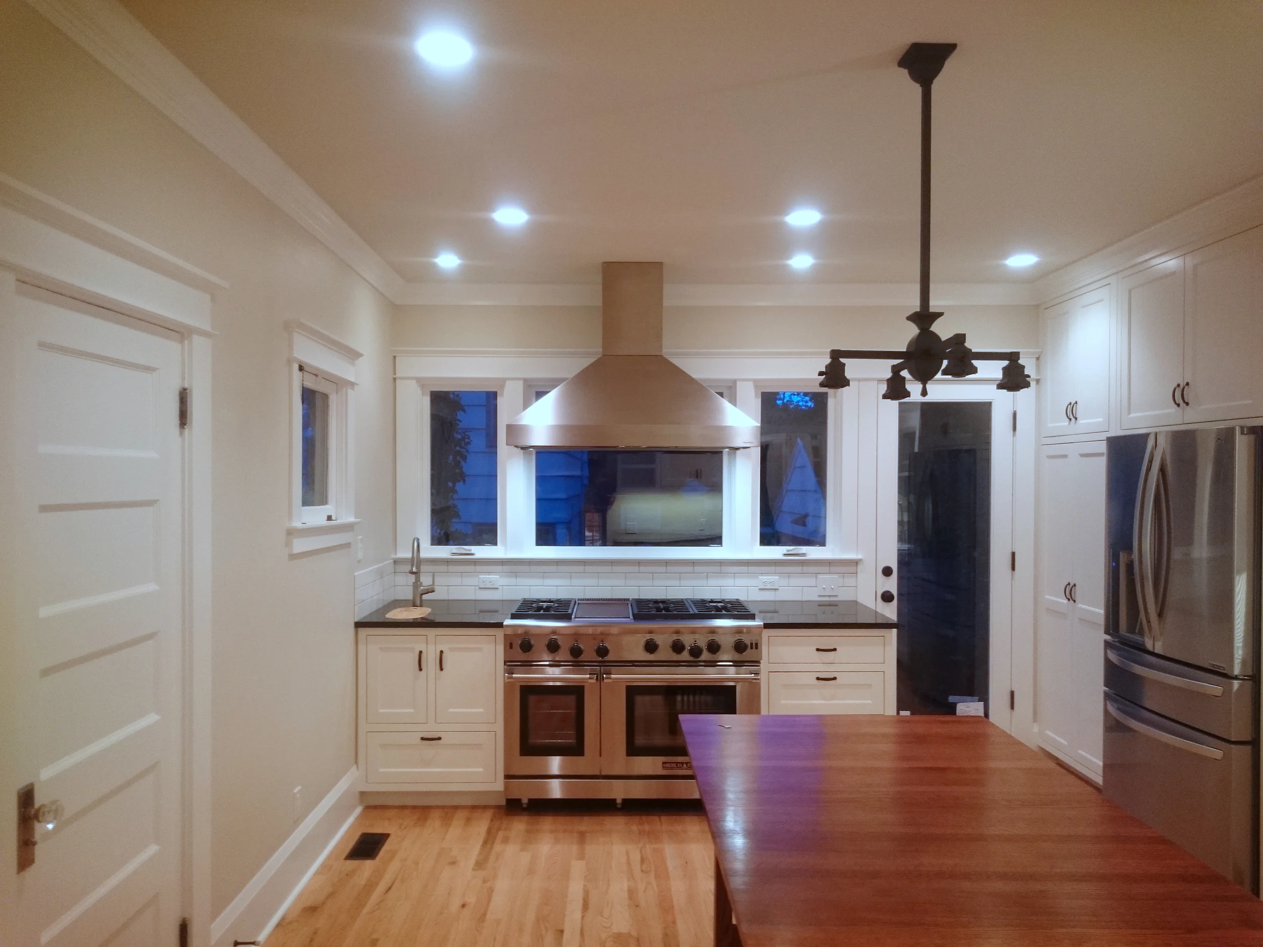
Half a year has flown by since we started designing the Grant Park Residence's kitchen remodel.  It's finally been completed with just a couple of finishing touches left.

For the center of the kitchen, the clients' opted for a table in the center of their kitchen to act as both an island for counter top utility and informal seating for everyday meals.  The kitchen sink, a deep drop in cast iron piece, is framed by the tall custom cabinetry for plenty of storage.  The clients have a beautiful garden in their back yard that they enjoy so we installed tall windows behind the range and put them into a deep 30" counter. There is also a small prep sink nearby to fill pots and wash items.  

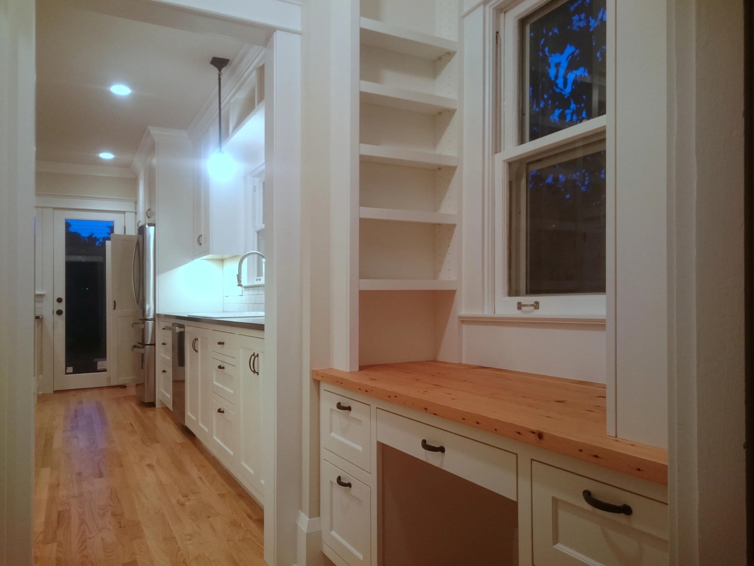
The end of the sink wall houses the refrigerator and pantry space. The pantry cabinet also houses the microwave and contains (2) deep pull out drawers below and (1) short pull out drawer above for visibility and ease of access. More tall storage cabinets sit above the pantry and refrigerator. 

A desk nook was built with adjustable shelving to frame the window. The desktop is crafted from reclaimed wood from the house. The original old wood was too good to pass up. 

Alphabet Condo, update

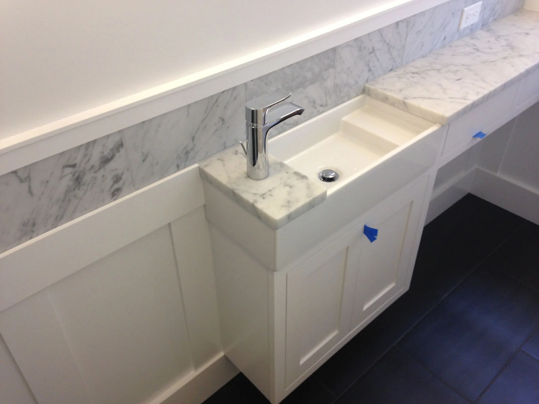
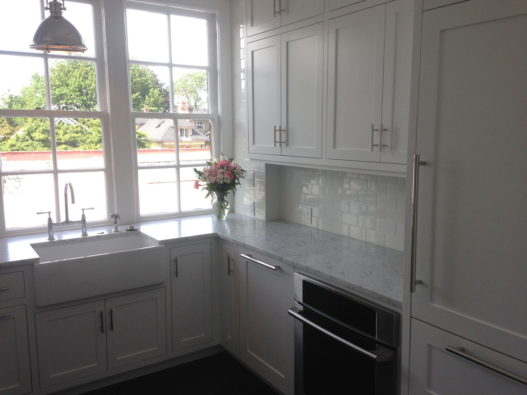
Work is drawing to a close at the Alphabet Condo, which we posted about early last month. Since then, tile and countertops have been installed, which complement the existing architecture of the space very nicely.

Looking Back at 2013

Skyline Residence Kitchen

Skyline Residence Kitchen

It's been another busy year for drw design build. A lot has happened since our last summary in 2012:

Before & After at the Skyline Residence

We're coming to the end of our work at the Skyline Residence, and it's incredible to look back and see the changes that have taken place since we began the process

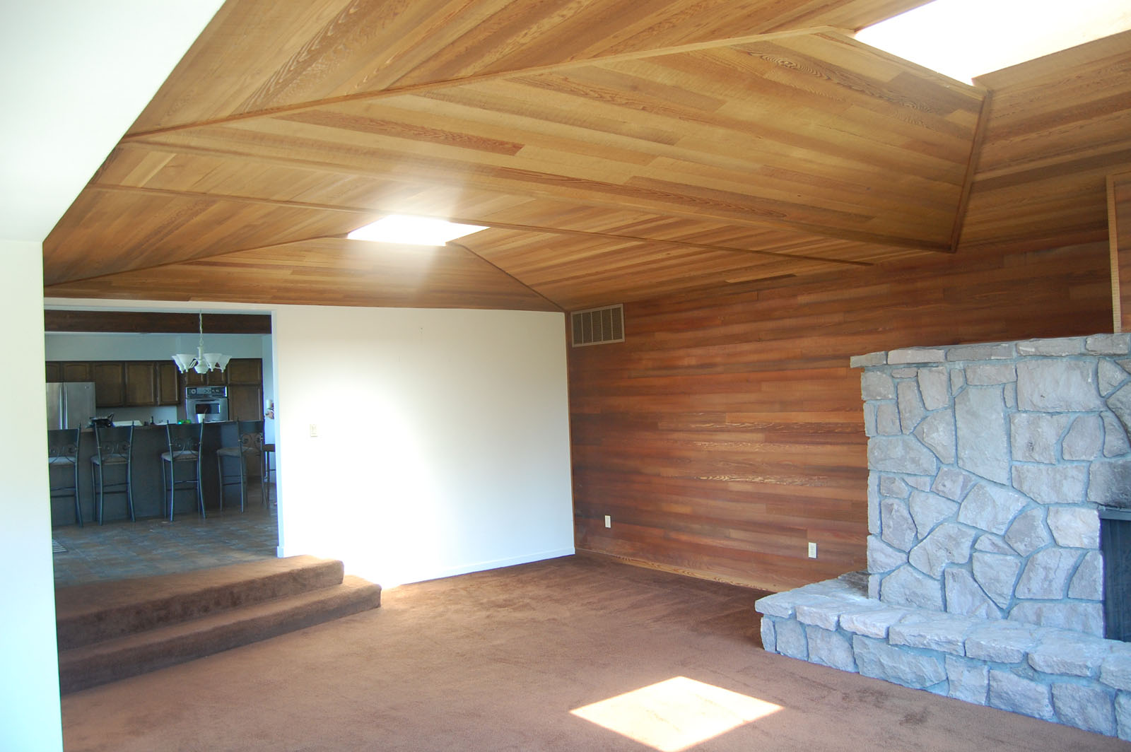
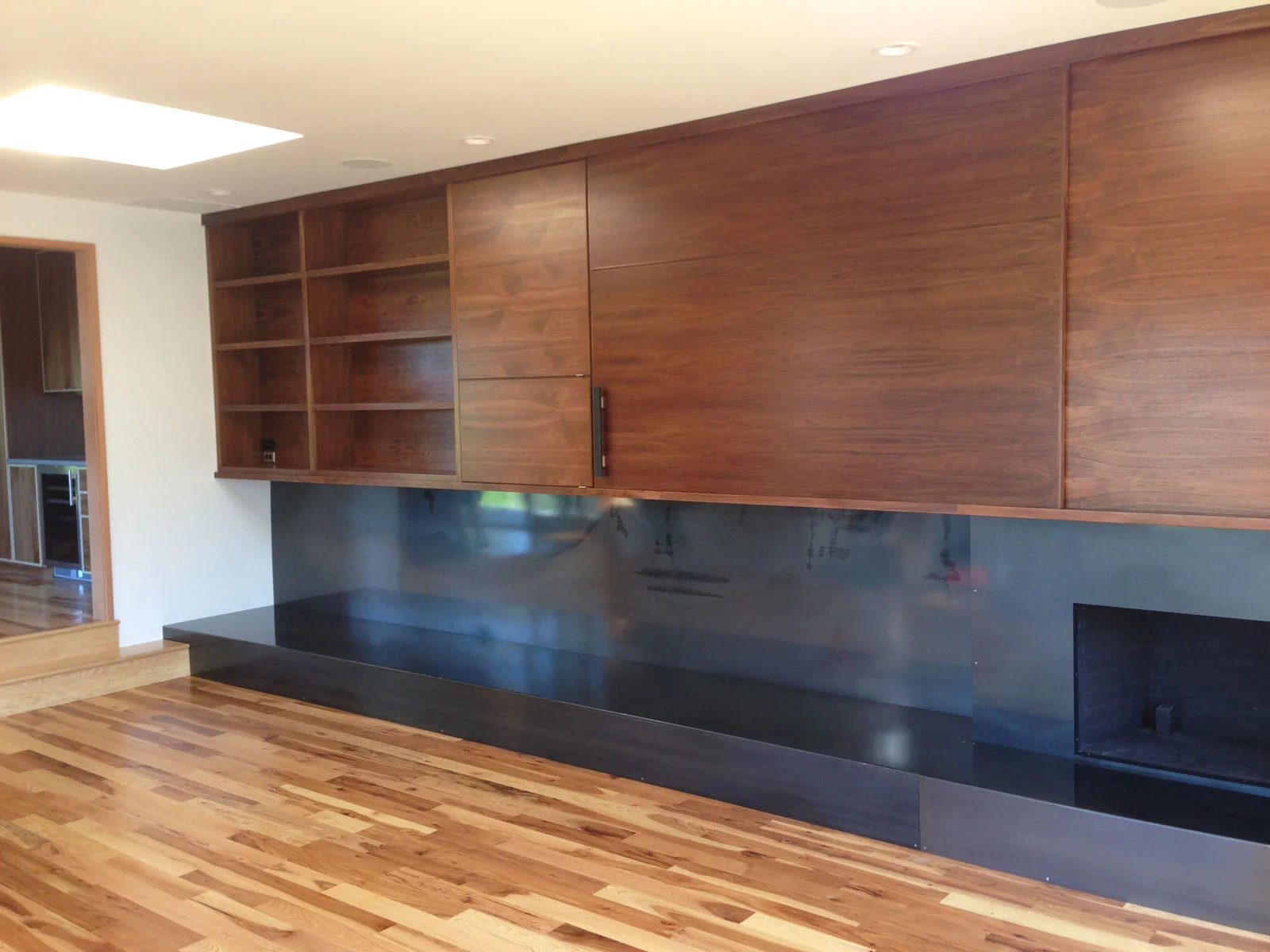
Living Room

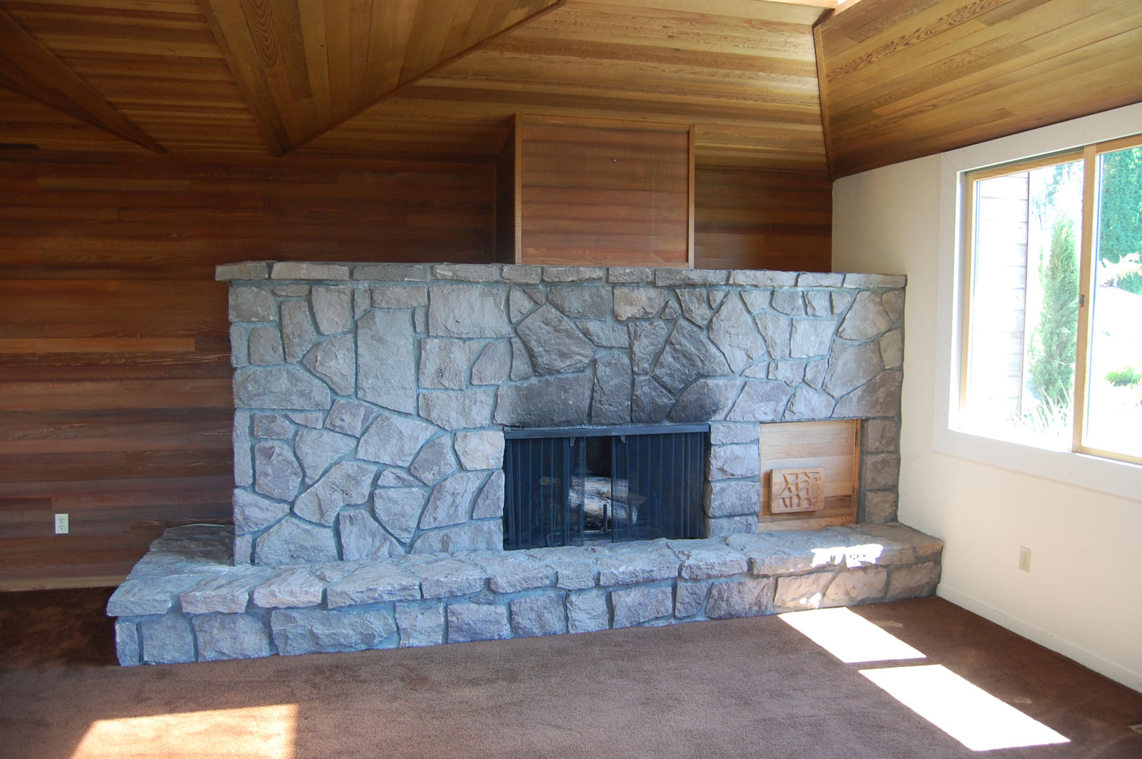
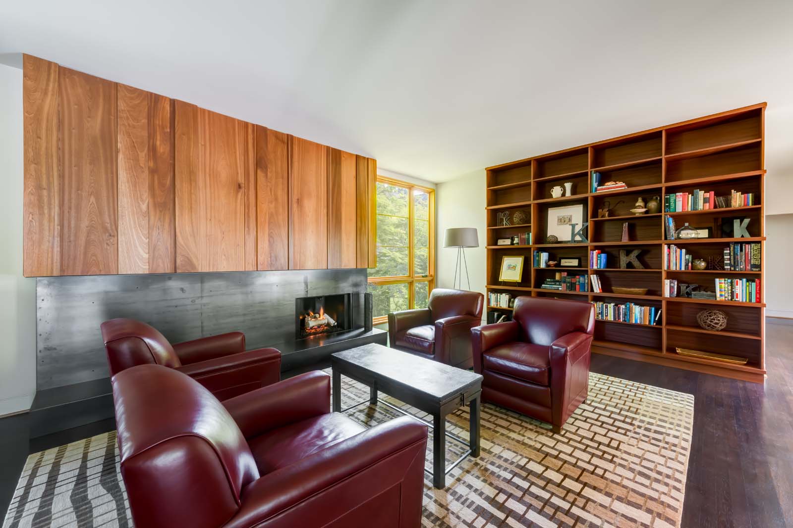
The living room was previously dominated by a stone-clad fireplace, which was high on the priority list of things the owners wanted to change. The first step was to strip the fireplace back to its concrete block structure.  Drawing on ideas we first explored at the Cable Hill House, we then built a sheet steel fire surround and hearth extension around it, with a walnut entertainment center above it.  This contains the audio/visual control boxes, and a sliding panel allows the tv to be hidden when not in use.  By removing the dropped ceiling, we were able to gain another 15" of ceiling height.  The carpet was replaced by new hickory floors, which run throughout the first floor of the house.

Kitchen

The kitchen remains in the same location in the house, but with a much more efficient layout and contemporary style.  The cabinets were custom made by Crownwood Construction, with exposed birch plywood frames and walnut panels. The island and main kitchen counter have a carrara marble countertop, which is nicely complemented by matte-white subway tiles at the backsplash.

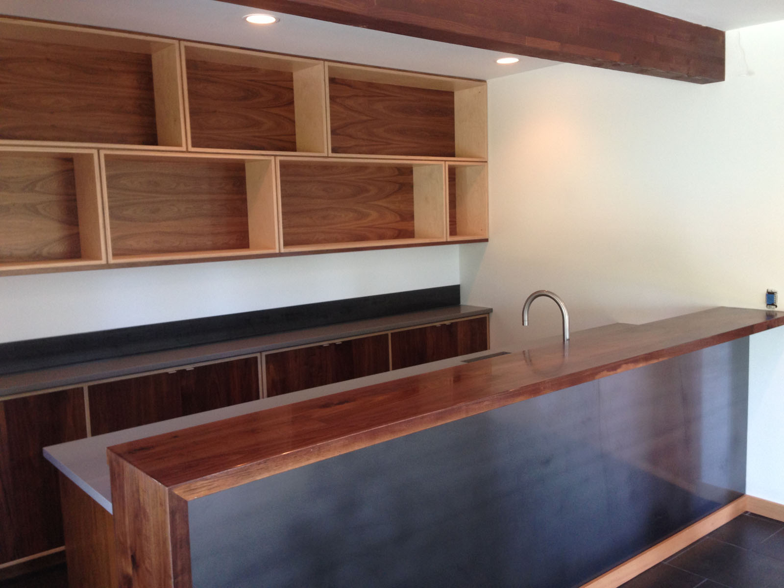
Bar

We added a new bar where a redundant second fire place previously existed.  The bar employs the same language of walnut and plywood cabinets, with some tougher materials for durability. The countertops are a grey quartz from Cosmos, and the backsplashes and bar-front are made of the same sheet steel we used at the fireplace in the living room.  We made a break from the hickory floors used throughout the rest of the first floor, and changed to tile, to make an appropriate transition to the pool immediately outside.

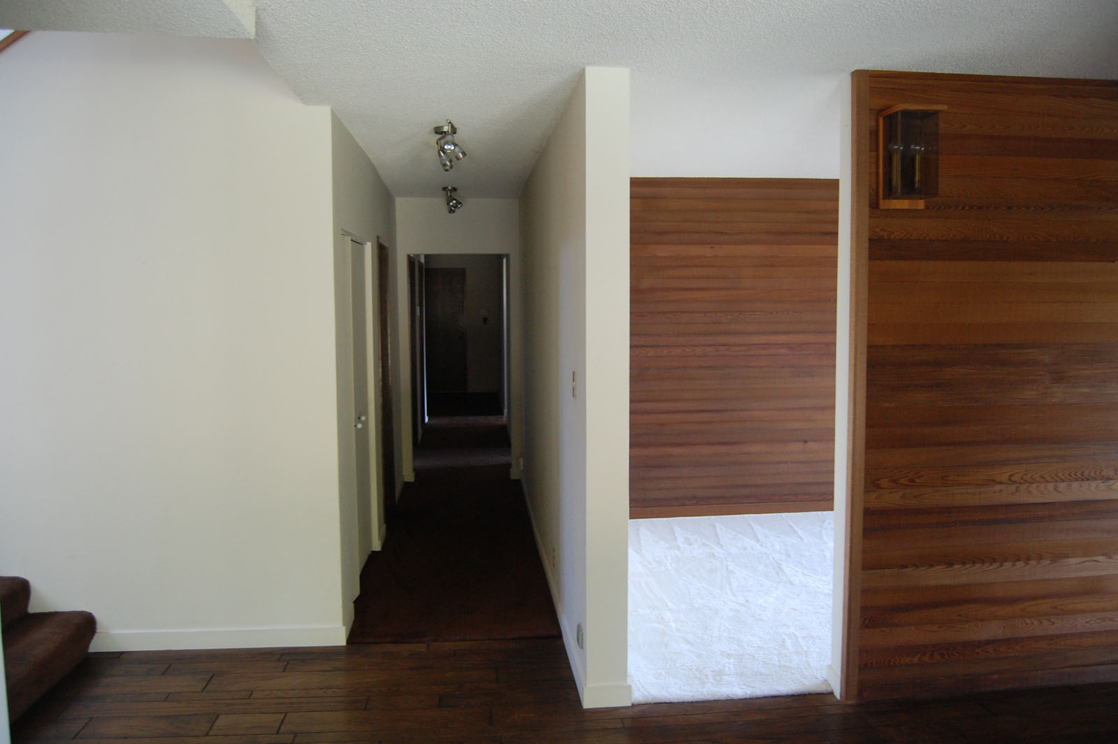
Hall & stair

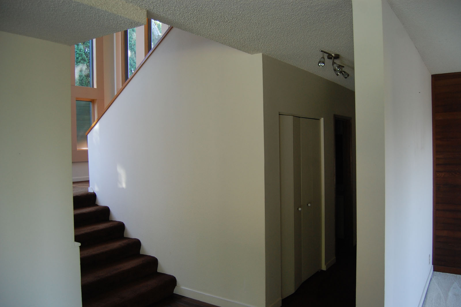
The hall was previously an unpleasant space, which felt dark and narrow.  Without changing the width of the hall, we able to create a much more inviting atmosphere. New openings along the wall dividing the hall from the public rooms increased the amount of natural lighting getting into the hall, which is supplemented by new can lighting. In the stair, we expanded on the approach we first employed at the Walsh residence by building a fir screen to filter the light coming into the space.  We demolished the partial height wall which was acting as a guardrail, and replaced it with a steel stair rail, which creates a stronger visual relationship between the two levels.  The previously utilitarian stairwell is now one of our favorite moments in the house.

Bathrooms

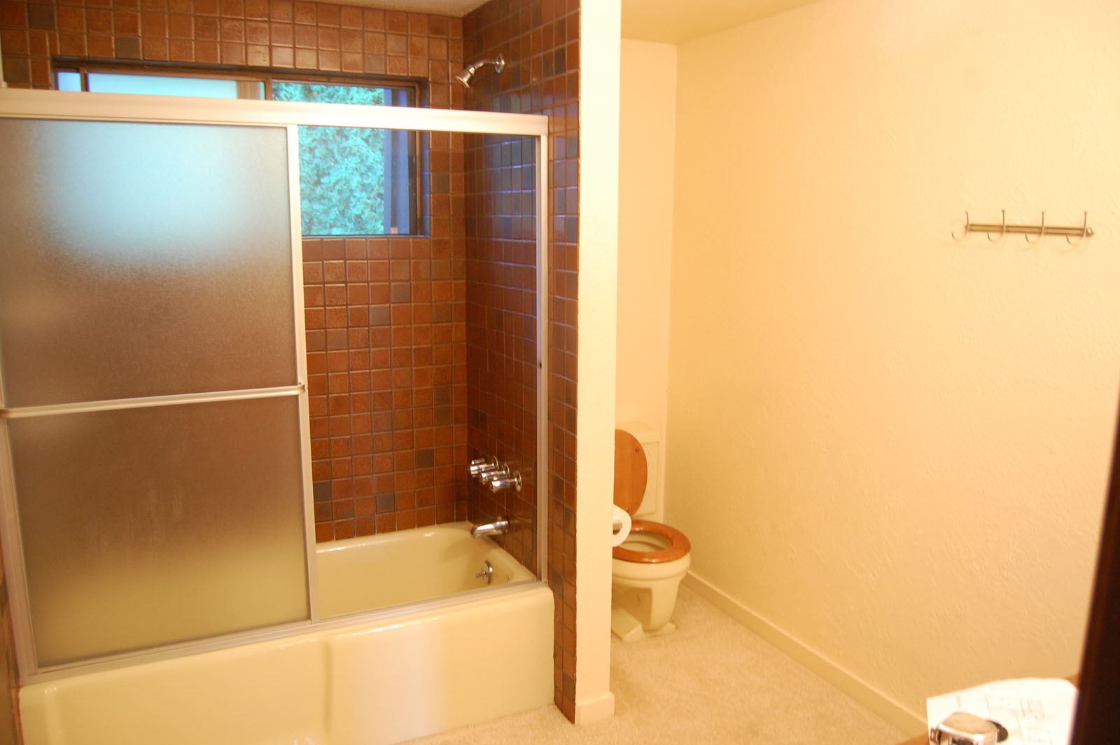
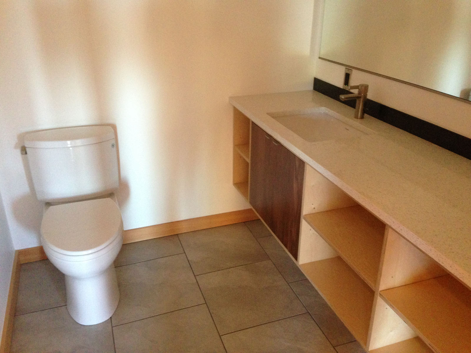
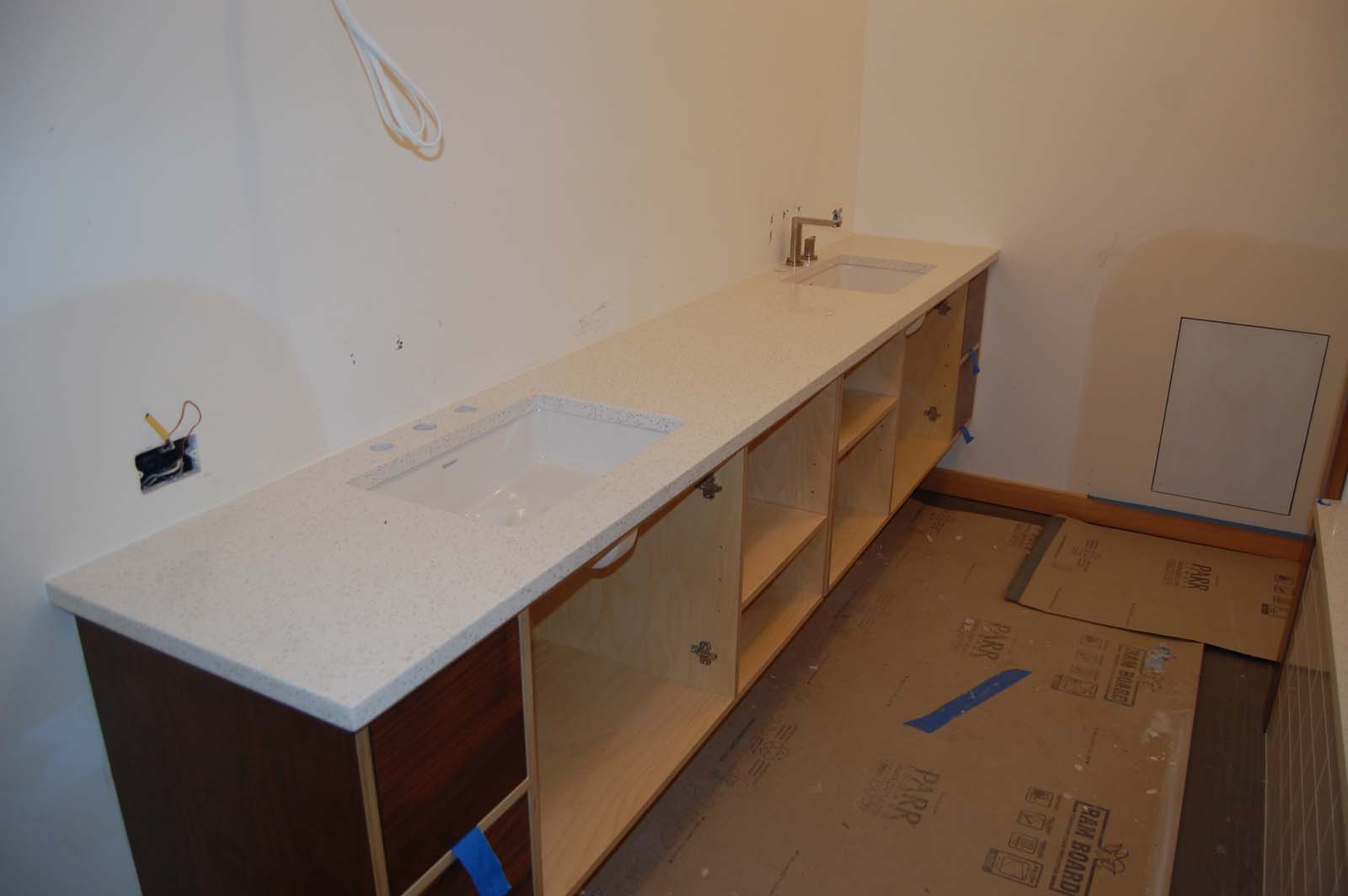
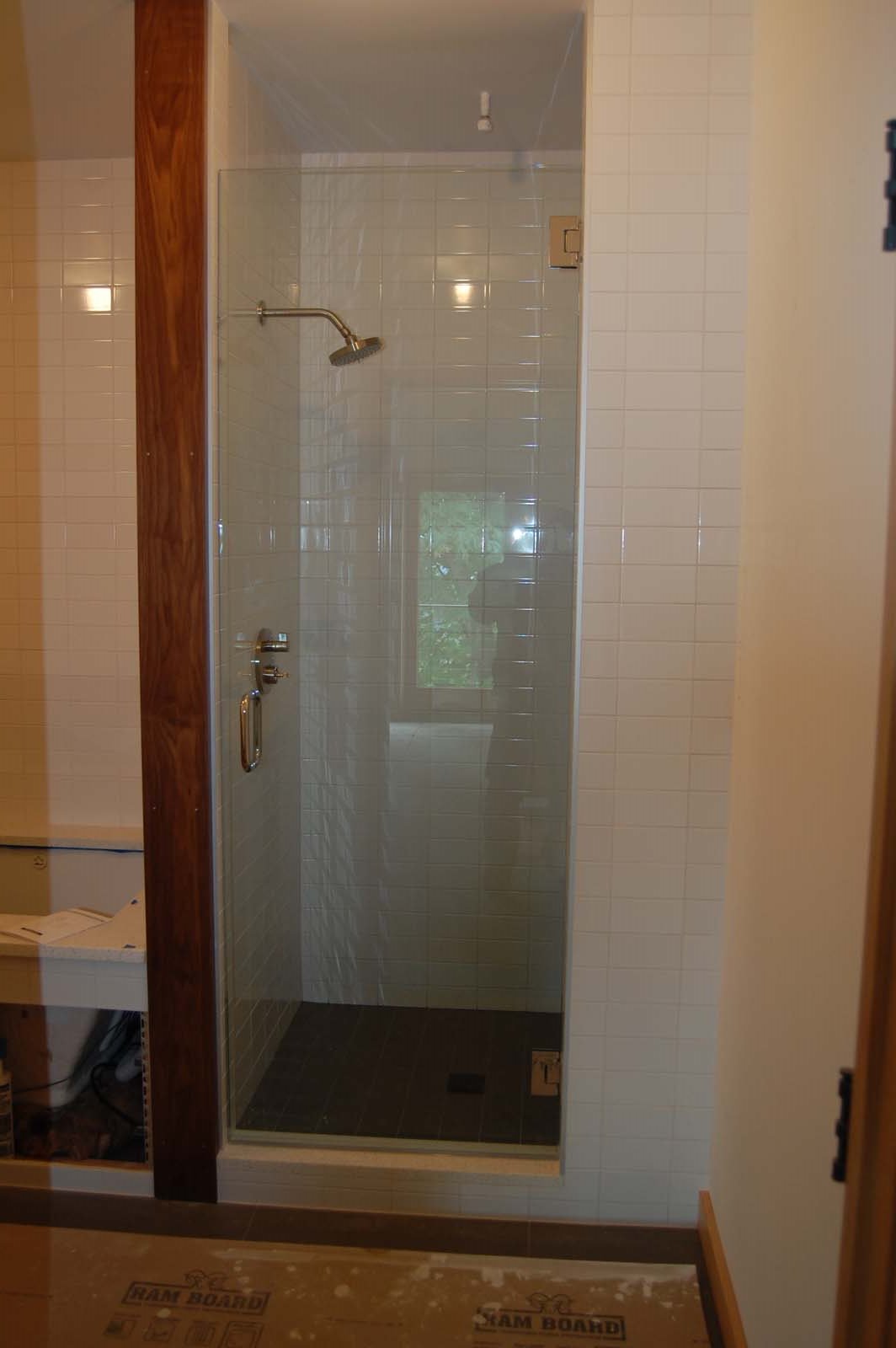
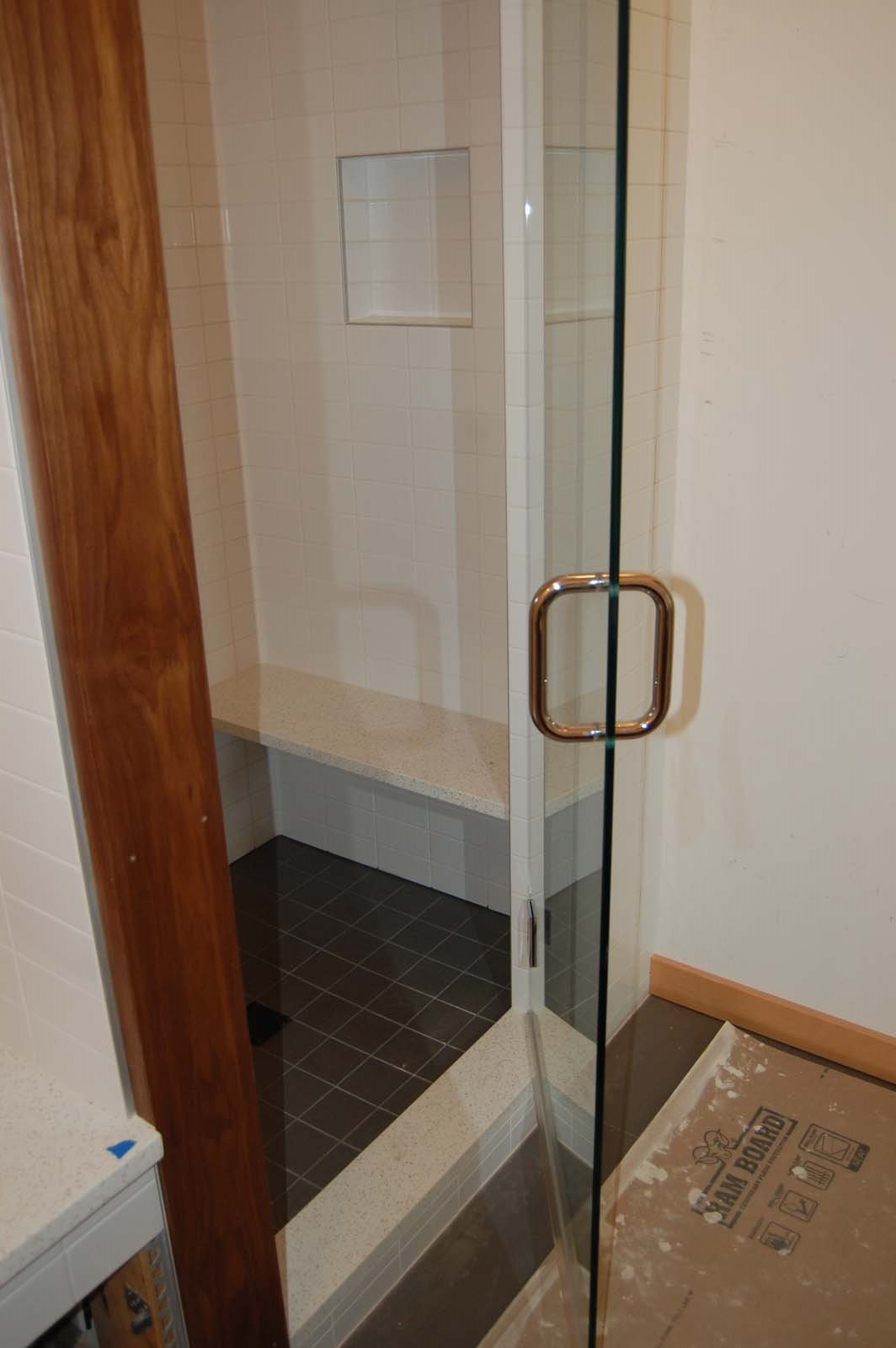
To avoid making major changes to plumbing and electrical system, we kept the existing layouts of the guest bathroom bathrooms, while making major changes to the finishes.  We continued the use of the walnut and plywood cabinets, but drew a visual distinction from the kitchen and bar areas by having the vanities float 12" off the floor, with tile running underneath them all the way to the wall.

Bedrooms

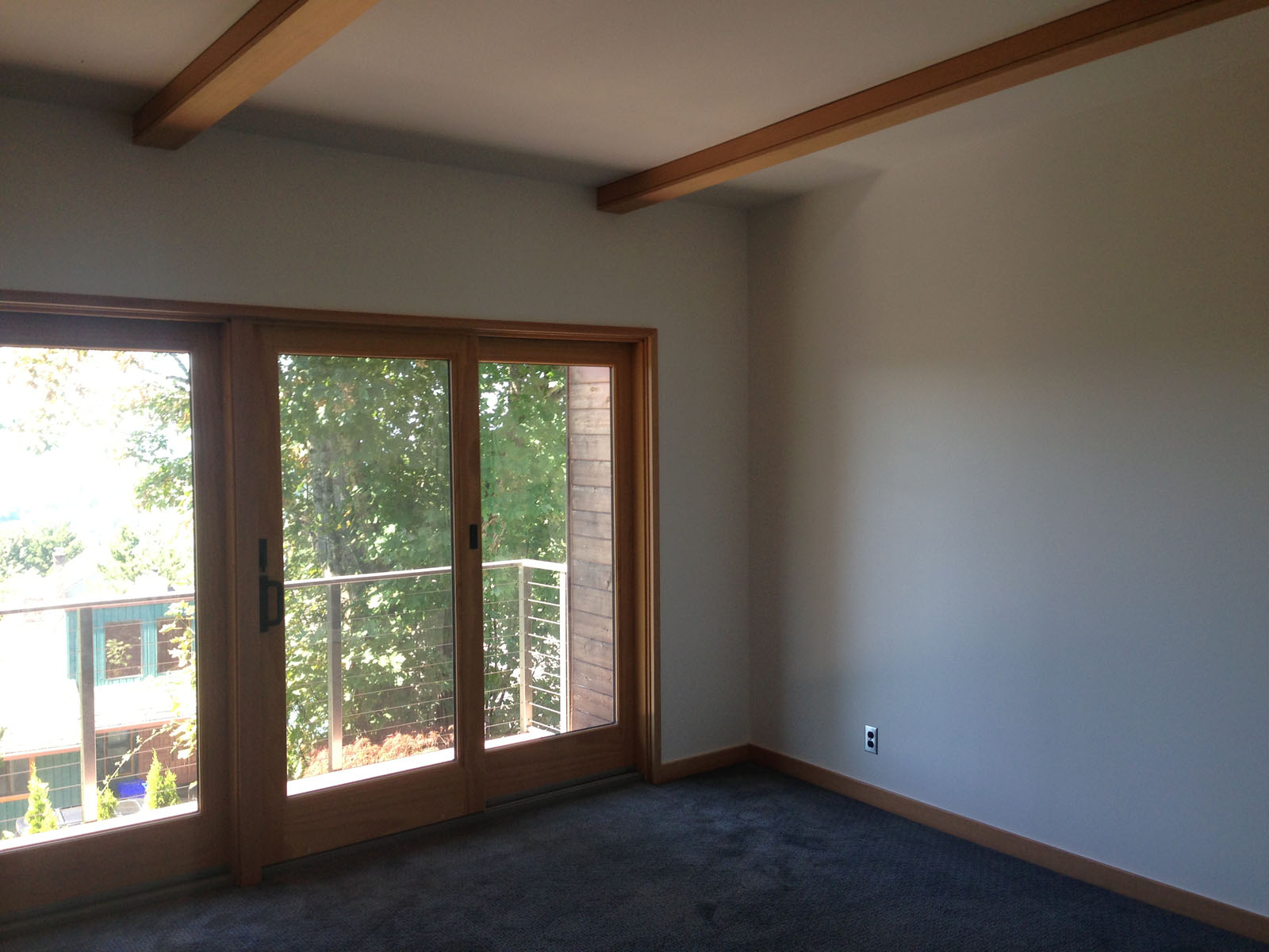
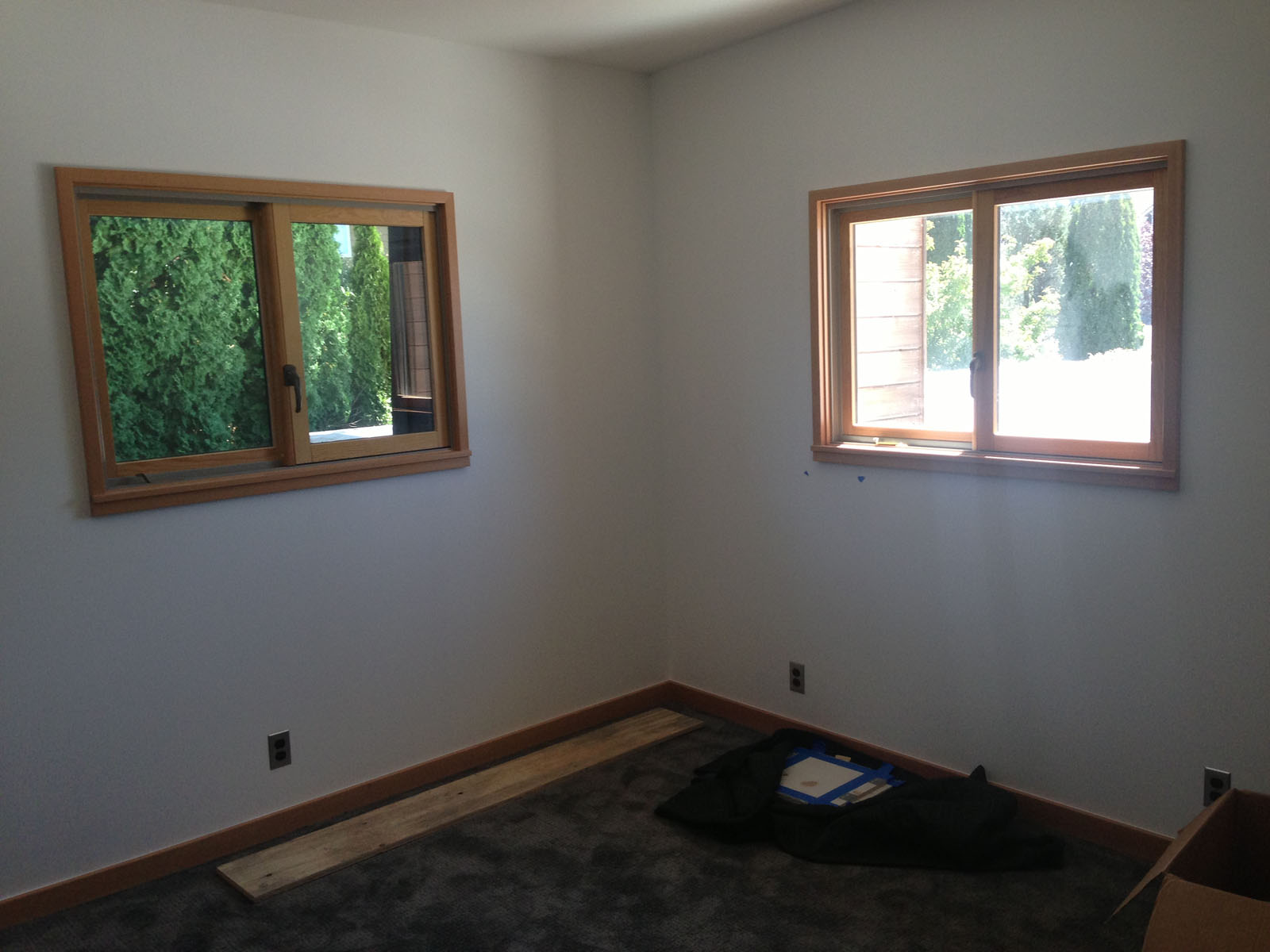
The layout of the bedrooms on the second floor generally worked well, so we only made minor alterations, primarily to create more closet space for the master suite. We installed new fir trim around the windows and ceiling beams, smoothed out and painted the walls, and installed new carpet throughout the second floor.

Skyline Residence Progress

The Skyline Residence is a project that we're really excited about, and it has been great to see it really come together in the last month. Since our last update, the cabinets and countertops have been installed, which has made a huge difference to the feel of the spaces.

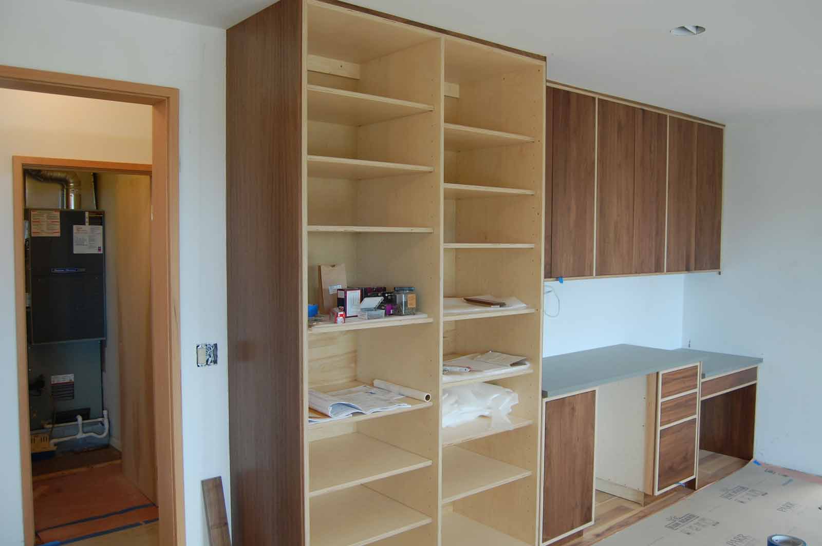
Throughout the house, we have used a consistent language of walnut faced cabinets, with exposed birch plywood frames.  We enjoy the way this celebrates the construction of the cabinets, and provides a nice tonal contrast between the two species of wood.  By varying the countertop material, we have been able to give a degree of visual differentiation to different rooms: the kitchen uses Carrara marble; the bar and pantry a dark grey quartz; and the bathrooms use a white quartz.


Cable Hill House Photo Update

We recently commissioned some photos of our Cable Hill House, and are really pleased with how they turned out.  Photos by Scott Larsen.

Humphrey Residence Guest Suite

We're delighted to have recently completed a small remodel of a guest suite in a house located on Portland's SW Humphrey Boulevard.  Designed in 1932 by architect Roscoe Hemenway, the house is one of Portland's classic residences.  The guest suite is on the second floor, at the end of what was originally as a service wing, with its own entrance from an exterior staircase.  Prior to our work, the space had been used as a live-at-home care suite and had quite an institutional feel to it.  Our clients approached us with the task of turning it into a guest suite, while retaining what we could of the existing building fabric. We began by dividing the existing "L" shaped space into two rooms, separated by a pair of glass pocket doors.  The larger of the two rooms will be kept as a bedroom, while the smaller becomes a more intimate sitting room with a new wood burning stove and a dutch door onto the exterior stair.  We removed the carpet in both spaces and refinished the existing fir floor that lay underneath.  We placed a new pocket door between the bathroom and sitting room, which required building out a new wall adjacent to the existing wall to avoid disturbing the plumbing stacks.  In the bathroom we added a new sink, toilet, bathtub and shower head, while keeping the existing tile in place.

We would like to thank our clients for giving us the opportunity to work on such a beautiful house, and hope that our work make it even more liveable as a home.


Looking back at 2012

2012 has flown by for all of us at DRW.  We've been working on a number of interesting projects, brought to us by new and repeat clients alike.  Thinking back on the year, a lot has happened.

We wish everybody a very happy New Year, and look forward to 2013.